Monday, April 18, 2011

Collection Design - Final Project

Concept Board 

Fabric Print


Technical Flats

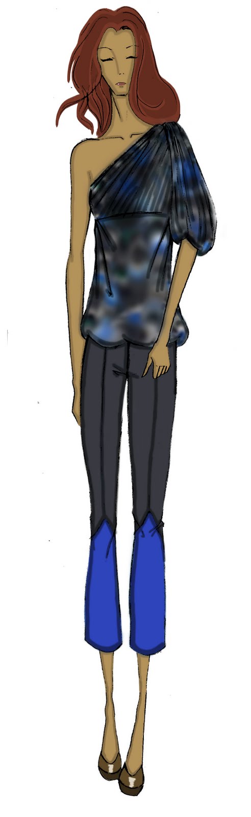
This is my final collection that includes a total of 15 looks and 2 technical flats. The look consists of 8 designs with 2 different colour ways. I hope my collection reflects my concept of nature, natural disasters and fluidity. I tried to incorporate prints and colours that are relevant and more earth/nature toned. I kept my designs simple and would use pleating, draping, and shearing effects to replicate the soft flow of water. 

 My collection would fall under Spring and Ready-to-Wear. My target market for this collection would be similar to that of BCBG. These looks are geared towards women from the age range of 20-35 with a medium income. These garments would be ideal for most formal events or parties as it mostly consists of day and evening dresses. My price range would be moderate, but not as high as BCBG. I feel that unless my company is well known or used high quality fabrics (eg. silks, wool, fur) I would not be able to charge my consumers a high price.


This skirt was a part of my final design. It is a simple circle skirt that is gathered at the hem to create a puff or balloon effect. The material used is polyester chiffon and the undergarment consists of a silk tulle skirt to hold out the skirt's shape. 

Monday, April 11, 2011

Fabric Patterns

After an inspirational presentation from Winston Wang, we have been given the chance to produce fabric prints for our final collection. After a lot of trial and error, I produced the following prints. These were done for practice and still need more work because some images do not repeat and the second print is made through tiling.


Pattern Inspiration

After searching the web for designs to incorporate into my print. I came across several interesting images...All these designs have a wave theme which is something I want to include in my print. My concept board will be focusing on natural disasters such as tsunamis therefore, water and nature will be a recurring theme.

Sources:
http://www.flickr.com/photos/buriednexttoyou/3528550382/in/photostream/

http://www.google.ca/imgres?imgurl=http://www.deviantart.com/download/126996282/Fractal_Stock___Wave_by_Catalyst_Design.png&imgrefurl=http://catalyst-design.deviantart.com/art/Fractal-Stock-Wave-126996282&usg=__HH23OIwnMxRi_kVgerjArH96bR0=&h=1080&w=1920&sz=5166&hl=en&start=532&zoom=1&tbnid=ucLlJ0kjM_knPM:&tbnh=101&tbnw=179&ei=omejTdbaOqjjiAKckNiQAw&prev=/search%3Fq%3Dwave%2Bdesign%26hl%3Den%26biw%3D1912%26bih%3D870%26gbv%3D2%26tbm%3Disch1%2C7125&chk=sbg&itbs=1&iact=hc&vpx=827&vpy=603&dur=1243&hovh=168&hovw=300&tx=149&ty=156&oei=tGajTZ6jE-PRiAKrtKn6Ag&page=11&ndsp=54&ved=1t:429,r:16,s:532&biw=1912&bih=870

http://www.google.ca/imgres?imgurl=http://us.123rf.com/400wm/400/400/dvarg/dvarg1011/dvarg101100061/8251102-abstract--background-set-red-wave-design.jpg&imgrefurl=http://www.123rf.com/photo_8251102_abstract--background-set-red-wave-design.html&usg=__yNCK32SbJFsW2z9KeTKp69w61eQ=&h=400&w=400&sz=24&hl=en&start=150&zoom=1&tbnid=UltCbzexvz6ZuM:&tbnh=133&tbnw=133&ei=kmSjTYWZCNTWiALT7NH1Ag&prev=/search%3Fq%3Dwave%2Bdesign%26hl%3Den%26biw%3D1912%26bih%3D870%26gbv%3D2%26tbm%3Disch0%2C2452&itbs=1&iact=rc&dur=160&oei=iWSjTfu6PIPliALM2fiTCA&page=4&ndsp=55&ved=1t:429,r:34,s:150&tx=80&ty=44&biw=1912&bih=870

Monday, April 4, 2011

Concept Board - Second Attempt


This is my second attempt at my concept board. This time I changed several images and expanded my colour theme. My theme/inspiration is still natural disasters, but there is less focus on tsunamis as I included more disaster images. I also included fabrics that suit my board and tried to specify my silhouette more clearly.

The concept board is still somewhat lacking in clarity. I believe this is because of the image arrangements on the board. Perhaps if the board flowed from soft to hard rather than being layed out all over it may be more clear. Overall, this board could be done better, but I hope my clients and target market will understand the concept I am trying to convey.

*Note
My photography skills are null

Concept Board - First Attempt


This is my first attempt at a concept board and my theme/inspiration is nature, or more specifically: tsunamis. My colour theme is designed to reflect nature such as blues, greys and greens.The most common image used on my board is water as I plan to use this in my final collection. In terms of silhouette, the look is loose and flowing, but still close to the body to reflect the flow of water or the swirl of a typhoon.

The reason why I chose nature as my concept is because it reflects our current zeitgeist. Natural disasters are occurring globally and the most recent one is the 9.0 earthquake and tsunami that occurred on March 11, 2011 in Japan. This disaster caused huge casualties and threatens the Pacific Rim. I wanted to show the destructive and uncontrollable effects of nature and yet how natural and beautiful it can be.We never know if and when North America will be hit by a natural disaster, but it is something we cannot predict or control.

The main issue with this concept board is cohesiveness. Some images are unnecessary and do not strengthen my concept. The fabrics that I have chosen do not match my theme. I need to be more specific in terms of silhouette and clarify how these images will translate into garments, shoes or jewellery.

Sunday, March 13, 2011

Chanel: The melting polar ice caps

For Chanel's Fall 2010 Ready-to-wear collection, the theme of the collection was inspired by nature. Perhaps driven by global warming and the melting of ice caps, the collection consisted of fur woven into tweed, shaggy snow boots, and ice jewelry. Even the stage for the models was made of icebergs to produce a frozen landscape. The play on silhouettes, angora sweater dresses, and innovative knitwear made the collection both comical and couture.

This is a good example of blending a nature inspired theme into a collection.


Sources:
http://www.style.com/fashionshows/review/F2010RTW-CHANEL

Saturday, March 12, 2011

Zeitgeist Today

In a 2010 article, American Fashion designer Michael Kors was interviewed by Style.com executive editor Nicole Phelps. They discussed his goals, ambitions and what has changed in the business. One quote that stood out in particular was the statement: "I don’t care what city, people are craving clothes they can hold on to, live in. Geoffrey Beene was a pragmatic couturier. He ripped the structure out of anything people thought of as old-school elegance and gave it comfort, ease. It’s American, yes, but it’s really international. It’s the zeitgeist that’s right for today. Phelps, 2010"


 This gives us an important insight into our current zeitgeist in North America. 

Full article:
http://www.style.com/stylefile/2010/06/michael-kors-the-rules-have-tumbled/

Dries Van Noten

He was born in Antwerp in 1958 to a family of tailors. His family ensured that he had a good knowledge of the fashion world an early age. He graduated from Antwerp's Royal Academy in design and did freelance work to produce his own collection. He has opened many boutiques and sells men's, women's and accessories worldwide.

 In 2009 he opened a boutique in Tokyo and a men's store in Paris in 2010. For his Fall 2011 women's collection he dedicated it to a "Liberal Woman" and brings 2 key flavors for fall: David Bowie and the Ballets Russes.


Sources:
http://www.driesvannoten.be/info-bio.php
http://www.style.com/fashionshows/review/F2011RTW-DVNOTEN/

Local Designer: Mandula

Hajnalka is the owner and designer of "Mandula", a local store in Vancouver. The designer's collection has a very organic feel, as every thread is hand dyed and the fabric is organically grown in Vancouver. Most of the collection has hand wrinkled designs and long wraps. The colours commonly used are black, white and cream.


Sources: 
http://demicouture.ca/2007/12/10/mandula-local-vancouver-design-at-its-best/
http://mandula.com/